Showing posts with label React. Show all posts

Friday, November 8, 2019

Easy to detect device from SharePoint SPFX React application

We have a SharePoint framework application need to behavior differently when invoked from mobile device. Here is the quick way to implement this.

1. Install react-device-detect package
npm install react-device-detect --save
2. Import the package
import {
  BrowserView,
  MobileView,
  isBrowser,
  isMobile
} from "react-device-detect";
3. Use it inside your application

  if(!isSubmitDisabled && !recordIsReadOnly && isMobile){

      submitMenuProps = {
        items: [
          {
            key: 'saveOnly',
            name:'Save only',
            secondaryText: 'Do not submit to approval workflow',
            text: 'Save as draft',
            title: 'Save without submitting to a workflow',
            iconProps: { iconName: 'Save'},
            onClick: this.props.onSaveOnly
          },                       
          {
            key: 'Submit',
            name:'Submit',
            secondaryText: 'Submit to approval workflow',
            text: 'Submit from Mobile',
            title: 'Submitting to a workflow',
            iconProps: { iconName: 'SaveToMobile'},
            onClick: this.props.onSubmit
          }                     
        ]
      };
    }

Monday, August 12, 2019

React component to display data in table format with scroll bar and pagination

There are many different ways you could choice to display data in table format with scroll bar and pagination in react. We decided to use react-table since it's simple and has many features.

React-table might be the easy way and it comes with both scroll bar and page pagination. You could configure the screen size to display and few customization to apply. There are few good examples to show the implementations. We are using this to display the workflow approvals and reviewers for SharePoint list item with pagination hidden.  Here is the screenshot.


The code is also very simple. Here is the sniipet.

return (
<div className={styles.container}>
<div className={styles.row}>
<Pivot>
<PivotItem headerText="Workflow Approvals" itemIcon="People">
<div className={styles.column}>
{/* <h3>Workflow Approvers</h3> */}
<ReactTable
data={data}
columns={[
{
columns: [
{
Header: "Name",
accessor: "name",
},
// {
// Header: "email",
// id: "email",
// accessor: d => d.email
// },
{
Header: "Role",
accessor: "role"
},
{
Header: "Status",
accessor: "status"
}
]
}
]}
defaultPageSize={5}
showPagination={false}
style={{
height: "200px" // This will force the table body to overflow and scroll, since there is not enough room
}}
className="-striped -highlight"
/>
</div>
</PivotItem>
<PivotItem headerText="Workflow Reviewers" itemIcon="People">
<div className={styles.column}>
{/* <h3>Workflow Approvers</h3> */}
<ReactTable
data={data1}
columns={[
{
columns: [
{
Header: "Name",
accessor: "name",
},
// {
// Header: "email",
// id: "email",
// accessor: d => d.email
// },
{
Header: "Reason",
accessor: "reason"
},
{
Header: "Status",
accessor: "status"
}
]
}
]}
defaultPageSize={5}
showPagination={false}
style={{
height: "200px" // This will force the table body to overflow and scroll, since there is not enough room
}}
className="-striped -highlight"
/>
</div>
</PivotItem>

</Pivot>
</div>
</div>
);


The mock-up data is listed below for your reference.

export const data1 = [
{
id: 22,
name: 'Test User',
email: 'test.user@mycompany.com',
role: 'Some role',
status: 'Open',
},
{
id: 23,
name: "John Smith",
email: 'jsmith@mycompany.com',
role: 'Pubs developer',
status: 'Open',
}

];

There are few other data tables you could check for your own purposes.

  1. React semantic UI
  2. Material UI
  3. Material table with group feature
  4. MD table
Some implementations are using bootstrap or other packages that we may not want to introduce to your project.


Monday, June 3, 2019

Different ways to add icon to your react office fabric UI project

You might need to add icons to your react office fabric UI project and here are different ways for your reference.

1. Add Office fabric icon directly if the component accept icon attribute. Here is one example for Pivot component for "Search" icon and "SearchAndApps" icons. The UI is displayed as the screenshot below.

              <Pivot>
                  <PivotItem headerText="Search by Isis Numbers" itemIcon="Search">
                    {/* Some React components here*/}
                  </PivotItem>
                  <PivotItem headerText="Search by Compound or Target" itemIcon="SearchAndApps" onRenderItemLink={this._customRenderer}>
               {/* Some React components here*/}                   
                  </PivotItem>

              </Pivot>


2. Add icon as separate component. Here is example to display lightbulb. There is limited style you could apply.

<div className={styles.row}>
<div className={styles.column}>
<Label required={true}> Submission Content </Label>
<Icon iconName={'Lightbulb'} className="ms-IconExample" />
</div>
</div>


You will see the lightbulb icon is in different row and it's difficult to display next to the Label in the same row. Another challenge is it's not possible to add event handler to the icon. The third challenge is the icon size is as default and will be difficult to change.

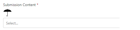
3. The third way is to convert icon to "svg" format and display in the component as below.

<div className={styles.row}>
<div className={styles.column}>
<Label required={true}> Submission Content </Label>
<svg className="umbrella" xmlns="http://www.w3.org/2000/svg"
width="32" height="32" viewBox="0 0 32 32" aria-labelledby="title">
<title id="title">Umbrella Icon</title>
<path d="M27 14h5c0-1.105-1.119-2-2.5-2s-2.5
0.895-2.5 2v0zM27 14c0-1.105-1.119-2-2.5-2s-2.5
0.895-2.5 2c0-1.105-1.119-2-2.5-2s-2.5 0.895-2.5
2v0 14c0 1.112-0.895 2-2 2-1.112 0-2-0.896-2-2.001v-1.494c0-0.291
0.224-0.505 0.5-0.505 0.268 0 0.5 0.226 0.5 0.505v1.505c0
0.547 0.444 0.991 1 0.991 0.552 0 1-0.451
1-0.991v-14.009c0-1.105-1.119-2-2.5-2s-2.5 0.895-2.5
2c0-1.105-1.119-2-2.5-2s-2.5 0.895-2.5
2c0-1.105-1.119-2-2.5-2s-2.5 0.895-2.5 2c0-5.415 6.671-9.825
15-9.995v-1.506c0-0.283 0.224-0.499 0.5-0.499 0.268 0 0.5 0.224
0.5 0.499v1.506c8.329 0.17 15 4.58 15 9.995h-5z"/>
{/* This is not wrorking!!! onMouseOut={() => this.mouseOut()}
onMouseOver={() => this.mouseOver()}>{this.label(this.state.displayDescription)} */}
</svg>
</div>
</div>


As you can see the same issue the icon is in separate line and cannot add event to the component. However, it's very easy to adjust the size of the icon. You could search the different methods to convert existing icon to svg format.

4. The forth way is to add emoji icon as text direct to the label. Here is one example.


  private label = displayDescription => {
    if (displayDescription === null) {
        return 'Mouse over to see the magic!';
      }
      return displayDescription ? 'Submission Content Details' : 'Submission Content 🔍';

  }

<div className={styles.row}>
<div className={styles.column}>
<Label required={true} onMouseOut={() => this.mouseOut()}
onMouseOver={() => this.mouseOver()}>{this.label(this.state.displayDescription)}
</Label>
</div>
</div>

You can see the icon is next to the label in same line. You could add event to the component. The only challenge is difficult to change the size of the icon.

Now you have the different ways to add icons to your React Office UI project. There are many different icons you could use. Here is the list.


  • Office fabric UI icons here and examples here
  • Material UI icons here and examples here
  • Semantic icons here
  • Fount awesome icons here
  • Other icon here
If you need to add icons to SharePoint list as list format, you could refer the good articles here.


Thursday, April 25, 2019

Cannot display selected office fabric ui dropdown value from SharePoint framework

We are using SharePoint framework with office fabric UI component. The current project is to use SPFx to display an list item that has a Dropdown field. The issue is we are getting the value all options as an array from the SharePoint but cannot display the option value already set in the list.

After few days debugging the issue, we have isolated to the SharePoint framework REACT how to pass the pros from parent to child component. Here is the simple code to reproduce this issue.

1. Hard coded the array like this below in parent component named LoopUp.

private defaultOptionList: IDropdownOption[] = [
{
key: '0',
text: 'None',
isSelected: false
},
{
key: '1',
text: 'Encore/Review Publication',
isSelected: true
},
{
key: '2',
text: 'Non-Scientific',
isSelected: false
},
{
key: '3',
text: 'Assay Method',
isSelected: false
},
{
key: '4',
text: 'Research Data',
isSelected: false
},
{
key: '5',
text: 'PK/Tox Data',
isSelected: false
},
{
key: '6',
text: 'Clinical Data',
isSelected: false
},
{
key: '7',
text: 'Clinical Study Design',
isSelected: false
},
{
key: '8',
text: 'Clintrials.gov Posting',
isSelected: false
}

];

2. If we initialize the state in the constructor below and pass to child, child can display the selected option value.  The state we set up is named submissionContentListState2.

constructor(props) {

super(props);
this.state = {
submissionContentListState2: [] = this.defaultOptionList, // Set in constructor
submissionContentListState4: [] // Set in componentDidMount
};

}

3. If we set the same value from  componentDidMount  like below, child cannot display the selected value. The state we set up is named submissionContentListState4.

public componentDidMount() {
this.setState({
submissionContentListState4: this.defaultOptionList
});
}           

The code to pass to child is listed below.
public render(): React.ReactElement<ILoopUpProps> {

SPFacade.logOptions(this.state.submissionContentListState2, "Parent Rendor submissionContentListState2");
SPFacade.logOptions(this.state.submissionContentListState4, "Parent Rendor submissionContentListState4");
return (
<Child
defaultOptionListParent2={this.state.submissionContentListState2} // This is in constructor
defaultOptionListParent4={this.state.submissionContentListState4} // This is in componentDidMount
/>

);
}


The code in child is listed below.
import * as React from 'react';
import styles from './LoopUp.module.scss';
import { ILoopUpProps } from './ILoopUpProps';
import { Dropdown, IDropdownOption } from "office-ui-fabric-react";
import { SPFacade } from "./SPFacade";

export class Child extends React.Component<any,
{
}
> {
constructor(props) {
// Required step: always call the parent class' constructor
super(props);
}
public render(): React.ReactElement<ILoopUpProps> {

SPFacade.logOptions(this.props.submissionContentListState2, "Child Rendor submissionContentListState2");
SPFacade.logOptions(this.props.submissionContentListState4, "Child Rendor submissionContentListState4");
return (
<div className={ styles.loopUp }>
<div className={ styles.container }>

<div className={ styles.row }>
<div className={ styles.column }>
<Dropdown
placeHolder="Select a content type"
required={true}
label="Lokup values from parent props set in constructor - working"
options={this.props.defaultOptionListParent2}
/>
</div>
</div>

<div className={ styles.row }>
<div className={ styles.column }>
<Dropdown
placeHolder="Select a content type"
required={true}
label="Lokup values from parent props set in componentDidMount - not working"
options={this.props.defaultOptionListParent4}
/>
</div>
</div>

</div>
</div>
);
}

}


The result is show as below.

You can see the top DOM element did show the selected value named "Encore/Review Publications". However, the bottom DOM element could not display the selected value even all the option values are retrieved.

This is a show stopper for us at this point since we need to get the value from SharePoint list item and it should be done in componentDidMount function and cannot be in constructor.

If you know the solution or workaround, please let me know.

The complete parent code is listed below.

import * as React from 'react';
import { ILoopUpProps } from './ILoopUpProps';
import { IDropdownOption } from "office-ui-fabric-react";
import { Child } from "./Child";
import { SPFacade } from "./SPFacade";

export default class LoopUp extends React.Component<ILoopUpProps,
{
submissionContentListState2: IDropdownOption[];
submissionContentListState4: IDropdownOption[];
}
> {

private defaultOptionList: IDropdownOption[] = [
{
key: '0',
text: 'None',
isSelected: false
},
{
key: '1',
text: 'Encore/Review Publication',
isSelected: true
},
{
key: '2',
text: 'Non-Scientific',
isSelected: false
},
{
key: '3',
text: 'Assay Method',
isSelected: false
},
{
key: '4',
text: 'Research Data',
isSelected: false
},
{
key: '5',
text: 'PK/Tox Data',
isSelected: false
},
{
key: '6',
text: 'Clinical Data',
isSelected: false
},
{
key: '7',
text: 'Clinical Study Design',
isSelected: false
},
{
key: '8',
text: 'Clintrials.gov Posting',
isSelected: false
}

];

constructor(props) {

super(props);
this.state = {
submissionContentListState2: [] = this.defaultOptionList, // Set in constructor
submissionContentListState4: [] // Set in componentDidMount
};

}

// Get the itemId received form the parent and display attachment if itemId is not NaN
public componentDidMount() {
this.setState({
submissionContentListState4: this.defaultOptionList
});
}

public render(): React.ReactElement<ILoopUpProps> {

SPFacade.logOptions(this.state.submissionContentListState2, "Parent Rendor submissionContentListState2");
SPFacade.logOptions(this.state.submissionContentListState4, "Parent Rendor submissionContentListState4");
return (
<Child
defaultOptionListParent2={this.state.submissionContentListState2} // This is in constructor
defaultOptionListParent4={this.state.submissionContentListState4} // This is in componentDidMount
/>

);
}


}