Tuesday, July 16, 2019

Easy way to hide SharePoint online event list some fields like “All Day Event” and “Recurrence”

When we create a new calendar that is an event list  on SharePoint online site, as default it will display fields like  "All Day Event" and "Recurrence" as in the below screenshot. In some cases, you may not want these fields and here are different ways to hide them.


1. The most common way is to use SharePoint designer to create new form and then remove the fields in the advanced design. This has been described here in details.

The major challenge is the designer is not reliable toll and you might constantly get the following error "could not save the list changes to the server" like discussed here. I'm always getting this error and could not resolve it quickly. This is the way I would NOT recommend you to try!

2. The second way is to use Powershell to set the fields like described here. The key Powershell command is like below.

    $field = $list.Fields["FieldName"]
    $field.ShowInNewForm = $false
    $field.Update()
However, I'm not able to find the equivalent PnP SharePoint online command. If you do, please let me know. This Powershell command seems only works for SharePoint on-premises.

3. The third way is to use the OoB UI with few tricks. Here is the details.
  • Go to "List Settings" -> Advanced settings" -> Set “Allow management of content types?” to “Yes”.
  • Click the content type used in the event list and click one field with link like “Category”. You will be able to make the field “Hidden”. 
  • Two fields like “All Day Event” and “Recurrence” do not have direct link you could modify. You should copy the URL from previous "Category" field like this.


  • You could now remove the "Fid" Parameter and replace "Field" Parameter value with either "fRecurrence" or "fAllDayEvent". 


Please note if you hide the “All Day Event”  on the content type as in method #3, the calendar cannot be displayed in the event webparts! The events will be empty.

4. The forth way is to use the javascript if this is allowed on the SPO site. Here is the details.

Add a content editor webpart on respective pages (NewForm.aspx/ DispForm.aspx/ EditForm.aspx) and use below jQuery code to hide SharePoint field. 

<script src="https://ajax.googleapis.com/ajax/libs/jquery/3.3.1/jquery.min.js"></script>
<script>
$(document).ready(function(){
$('nobr:contains("Category")').closest('tr').hide(); //here we are hiding field named "Category"
$('nobr:contains("All Day Event")').closest('tr').hide(); //here we are hiding field named "All Day Event"
$('nobr:contains("Recurrence")').closest('tr').hide(); //here we are hiding field named "Recurrence"
});
</script>
This method will hide the fields and still allow the event webpart to display the calendar events. However, this is only applicable when script is allowed on the site. If not, you could enabled it.

Now you should be able to hide  “All Day Event” and “Recurrence” along with other fields you want to hide from end users.

There should be other ways like Rest/Graph API to hide, or may be SPFx customization you can try. 


Thursday, June 13, 2019

Procedure to use new custom properties to SPFx ListView Command project

If you need to add a new custom property like "sampleTextThree" with value "This is new text." to be used in SPFX extension ListView Command project. You should following the following steps.
1. Add sampleTextThree as string in the interface
sampleTextOne: string;
sampleTextTwo: string;
sampleTextThree: string;

2. Add property to serve.json like below.

"default": {
"pageUrl": "https://mysompont.sharepoint.com/sites/HarryTestX/Shared%20Documents/Forms/AllItems.aspx",
"customActions": {
"4de6483f-cccf-465d-b0ee-4aa6ebb0eb81": {
"location": "ClientSideExtension.ListViewCommandSet.CommandBar",
"properties": {
"sampleTextOne": "One item is selected in the list",
"sampleTextTwo": "This command is always visible.",
"sampleTextThree": "This is new text."
...

3. Change the default alert to use new property.

switch (event.itemId) {
case 'COMMAND_3':
Dialog.alert(${this.properties.sampleTextThree});
...

4. Gulp serve run locally is fine. However, after this deployed to tenant, the property cannot be found and is "null" as indicated in here.

You should add another step#5.
5. Add the new custom property to "elements.xml" like below.
 ClientSideComponentProperties="{&quot;sampleTextOne&quot;:&quot;One item is selected in the list.&quot;, &quot;sampleTextTwo&quot;:&quot;This command is always visible.&quot;**, &quot;sampleTextThree&quot;:&quot;This command is new text.&quot;**}">

From my understanding, the serve.json is used by run locally "gulp serve" and the elements.xml is used by SharePoint online tenant. At this point, the new property can be picked up locally or deployed to SPO tenant.
I'm hoping the SPFx can enhance the build process to incorporate the configuration from serve.json and build to element.xml.

One trick to resolve SPFx extension ListView Commands loading manifests script error

As a SharePoint framework (SPFx) developer, three is continues challenge on daily development. There is a common error after run the SPFx extension ListView Commands project locally. The issue is after you have run "gulp serve" once against one site collection and then stopped the local gulp serve, there is always a error message when you browse the site. Here is the error message and the screenshot.

"Error loading debug script. Ensure the server is running and the “debugManifestsFile” parameter URL is correct."

Error: Script error for "https://localhost:4321/temp/manifests.js" 
https://requirejs.org/docs/errors.html#scripterror


Even you have the solution deployed and the SPFx command added to the site, after this message, the commands will NOT appear on the list or library.

After frustration debugging this issue, here is the procedure to resolve this issue.

1. Logout from SharePoint online.
2. Clear browse cache.
3. Login to SharePoint again

You might need to do this few time until cache is cleaned. You could also open another private browser to avoid this issue.


Wednesday, June 12, 2019

How to add office fabric icon to SharePoint framework extension ListView Commands

When you use SharePoint framework extension ListView Commands, you will notice that the icon is configured to point to the local file like the configuration below.

  "items": {
    "COMMAND_1": {
      "title": { "default": "Eln Init" },
      "iconImageUrl": "icons/cancel.png",
      "type": "command"
    }
  }

Unless you download and place the icon to some where, there is no OoB easy way to point to office fabric icon. There is a user voice you should vote so this can be added in the future. At meantime, here is the way to use as base64-encoded image described here as the workaround.

Here is the detailed procedure to convert Office fabric UI icons to base64-encoded image so you could use in the SPFx extension ListView Commands.

1. Search the Office fabric UI icons you need here and copy the icon name like "Archive".

2. Use Josh's tool online to convert to base64-encoded image. You could change the color and some other parameters. After clicking the "Render Front Icon", you could copy the "Data URL" as the base64-encoded image.


3. You could "Color picker" online to identify the color you need as the screenshot below.


4. You could paste the copied to serve.json.

  "items": {
    "COMMAND_1": {
      "title": { "default": "Eln Archive" },
      "iconImageUrl": "data:image/png;base64,iVBORw0KGgoAAAANSUhEUgAA......",
      "type": "command"
    }

  }

Now the icon will be displayed after solution deployed.


Of cause you could also download the icon and placed to CDN or local SharePoint site. Hope the future enhancement will allow us to direct point to office fabric icon.

Monday, June 3, 2019

Different ways to add icon to your react office fabric UI project

You might need to add icons to your react office fabric UI project and here are different ways for your reference.

1. Add Office fabric icon directly if the component accept icon attribute. Here is one example for Pivot component for "Search" icon and "SearchAndApps" icons. The UI is displayed as the screenshot below.

              <Pivot>
                  <PivotItem headerText="Search by Isis Numbers" itemIcon="Search">
                    {/* Some React components here*/}
                  </PivotItem>
                  <PivotItem headerText="Search by Compound or Target" itemIcon="SearchAndApps" onRenderItemLink={this._customRenderer}>
               {/* Some React components here*/}                   
                  </PivotItem>

              </Pivot>


2. Add icon as separate component. Here is example to display lightbulb. There is limited style you could apply.

<div className={styles.row}>
<div className={styles.column}>
<Label required={true}> Submission Content </Label>
<Icon iconName={'Lightbulb'} className="ms-IconExample" />
</div>
</div>


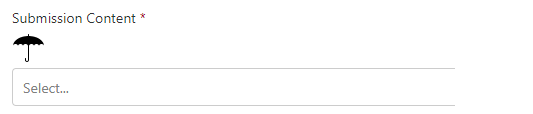
You will see the lightbulb icon is in different row and it's difficult to display next to the Label in the same row. Another challenge is it's not possible to add event handler to the icon. The third challenge is the icon size is as default and will be difficult to change.

3. The third way is to convert icon to "svg" format and display in the component as below.

<div className={styles.row}>
<div className={styles.column}>
<Label required={true}> Submission Content </Label>
<svg className="umbrella" xmlns="http://www.w3.org/2000/svg"
width="32" height="32" viewBox="0 0 32 32" aria-labelledby="title">
<title id="title">Umbrella Icon</title>
<path d="M27 14h5c0-1.105-1.119-2-2.5-2s-2.5
0.895-2.5 2v0zM27 14c0-1.105-1.119-2-2.5-2s-2.5
0.895-2.5 2c0-1.105-1.119-2-2.5-2s-2.5 0.895-2.5
2v0 14c0 1.112-0.895 2-2 2-1.112 0-2-0.896-2-2.001v-1.494c0-0.291
0.224-0.505 0.5-0.505 0.268 0 0.5 0.226 0.5 0.505v1.505c0
0.547 0.444 0.991 1 0.991 0.552 0 1-0.451
1-0.991v-14.009c0-1.105-1.119-2-2.5-2s-2.5 0.895-2.5
2c0-1.105-1.119-2-2.5-2s-2.5 0.895-2.5
2c0-1.105-1.119-2-2.5-2s-2.5 0.895-2.5 2c0-5.415 6.671-9.825
15-9.995v-1.506c0-0.283 0.224-0.499 0.5-0.499 0.268 0 0.5 0.224
0.5 0.499v1.506c8.329 0.17 15 4.58 15 9.995h-5z"/>
{/* This is not wrorking!!! onMouseOut={() => this.mouseOut()}
onMouseOver={() => this.mouseOver()}>{this.label(this.state.displayDescription)} */}
</svg>
</div>
</div>


As you can see the same issue the icon is in separate line and cannot add event to the component. However, it's very easy to adjust the size of the icon. You could search the different methods to convert existing icon to svg format.

4. The forth way is to add emoji icon as text direct to the label. Here is one example.


  private label = displayDescription => {
    if (displayDescription === null) {
        return 'Mouse over to see the magic!';
      }
      return displayDescription ? 'Submission Content Details' : 'Submission Content 🔍';

  }

<div className={styles.row}>
<div className={styles.column}>
<Label required={true} onMouseOut={() => this.mouseOut()}
onMouseOver={() => this.mouseOver()}>{this.label(this.state.displayDescription)}
</Label>
</div>
</div>

You can see the icon is next to the label in same line. You could add event to the component. The only challenge is difficult to change the size of the icon.

Now you have the different ways to add icons to your React Office UI project. There are many different icons you could use. Here is the list.


  • Office fabric UI icons here and examples here
  • Material UI icons here and examples here
  • Semantic icons here
  • Fount awesome icons here
  • Other icon here
If you need to add icons to SharePoint list as list format, you could refer the good articles here.


Tuesday, May 14, 2019

Procedure and tips to upgrade SharePoint framework project to 1.8.2

SharePoint framework version 1.8.2 released on May 7, 2019 along with many new features from 1.8 and few issues fixed. The major issues fixed are out of memory exceptions and Node.js 10 support.

Since SPFx 1.8.2 supports Node.js 10, it's a best practice to upgrade Node.js. We have a SPFx 1.7.1 that has been developed for over six month. What I did is to upgrade the SPFx to 1.8.2 first and then upgrade Node.js to 10. Here is the complete upgrade procedure based on our upgrade experience. There are few previous upgrade articles you may found useful.

1. Make a copy of the current project before upgrading. Run the following command to see the upgrade scope.

npm outdated

Here is what I have for my project. You can verify your SPFx version. In this case it's 1.7.1.


2. Install office365-cli upgarde command package using the following command. This is recommend upgrade method.

npm install -g @pnp/office365-cli

3. Use cli to generate upgrade instructions as the following command. Please run this command at the root of the project. The instruction will be saved to a file named "upgrade.md" displayed in the below screenshot.

o365 spfx project upgrade -o md > upgrade.md


4. Follow the each step in "upgrade.md" file to upgrade all the necessary packages. Each command has the instruction in the "upgrade.md" file. You might need to add "," for few lined added like the one below.

### FN012017 tsconfig.json extends property | Required

Update tsconfig.json extends property

In file [./tsconfig.json](./tsconfig.json) update the code as follows:

```json
{
  "extends": "./node_modules/@microsoft/rush-stack-compiler-2.9/includes/tsconfig-web.json"
}
```


File: [./tsconfig.json](./tsconfig.json)


This is the line you need to add "," at the end.
"extends": "./node_modules/@microsoft/rush-stack-compiler-2.9/includes/tsconfig-web.json",

"supportedHosts": ["SharePointWebPart"],


5. Run the following command to identify any missing third party components. Please pay attention to the packaged in RED.

npm outdated


You might need to reinstall them and here are the two we used.

npm install  react-select --save
npm install  @types/react-select –save

6. Upgrade other package in RED like @pnp/sp using the following command.

npm install @pnp/logging @pnp/common @pnp/odata @pnp/sp –save

If you run "npm outdated" again, you will have the following message. All RED messages have been resolved.


7. Try to clean and build the project and fix any issue. You may not have any compilation error but you should open the source file one by one to verify if there is any error. In our case, we have one error on the "TeachingBubble" Office fabric UI component as below. However, the gulp did not catch the error.


This is the change we made to fix this error.
                  {isTeachingBubbleVisible ? (
                    <div>
                      <TeachingBubble
                        targetElement={this._menuButtonElement}
                        hasSmallHeadline={true}
                        onDismiss={this._onTipDismiss}
                        hasCloseIcon={true}
                        primaryButtonProps={examplePrimaryButton}
                        headline="Some useful tip here. Boom!"
                      />
                        Some notes here about publiations and submissions. Could
                        include link to a web page with additional details.                       
                    </div>

                  ) : null}

During future upgrade, some react component may be changed and you will need to upgrade the code to latest implementation.

Please double check all source files and ensure no compilation error.

8. Upgrade Visual Studio code to latest version that is 1.33. at this time. This is recommended but not required.


10. Compile the project and verify everything work as expected.

gulp build
gulp serve

11. Upgrade Node.js to 10 that is recommended but not required.  
Remove the existing Node.js 8 from "Apps & features". Then download Node.js 10 and install. You could verify the new version using the following command. You could "ctr' + click" to open the file needs to be modified.

node -v

12. You may upgrade npm also.

npm install -g npm@latest

13. Upgrade gulp and yeomen generator using the following commands. You should also verify the generator version.

npm install -g yo gulp
npm view @microsoft/generator-sharepoint version

14. Rebuild environment related to new gulp and Node.js using the following command.

npm rebuild node-sass

15. Build the project and verify again.

gulp clean
gulp build
gulp serve

At this time, you should have the upgraded SPFx project. However, we found we have to use different generator to create new new SPFx project in 1.8.2 version. The detailed commands are listed below.

npm install -g @pnp/generator-spfx
yo @pnp/spfx

The project generated will use SPFx 1.8.2. I'm not sure if tehre is a way to use existing command yo @microsoft/sharepoint to create SPFx 1.8.2 project.

Friday, April 26, 2019

Which React Dorpdown or Selection component you should use in SharePoint framework SPFx React project?

When we use Office Fabric UI Dropdown component, we run into a issue that the value in the SharePoint list item value could not be displayed. As a result, we are looking for alternative for multiple dropdown component. Here is the list of the React dowpdown components we evaluated and my suggestion.

1. React-dropdown is a good candidate and it's extremely easy to configured. However, the issue is this is only support single selection. If you need multiple selection, this is not for you.

2. React-muti-select is another good example. However, the selected options will be displayed in another window as below picture that makes the UI not friendly.


3. Multi-select-react seems to be a nice component. However, there is an error when running this with SPFx React. This might be the version compatibility issue.

Error - [tsc] C:/Harry/Projects/Pubs/POC/Support/LookUp/node_modules/typescript/lib/tsc.js:55776
                throw e;
                ^
Error: Debug Failure.
    at typeToString (C:/Harry/Projects/Pubs/POC/Support/LookUp/node_modules/typescript/lib/tsc.js:23526:22)
    at reportRelationError (C:/Harry/Projects/Pubs/POC/Support/LookUp/node_modules/typescript/lib/tsc.js:28855:34)
    at isRelatedTo (C:/Harry/Projects/Pubs/POC/Support/LookUp/node_modules/typescript/lib/tsc.js:28972:21)
    at propertiesRelatedTo (C:/Harry/Projects/Pubs/POC/Support/LookUp/node_modules/typescript/lib/tsc.js:29382:43)
    at structuredTypeRelatedTo (C:/Harry/Projects/Pubs/POC/Support/LookUp/node_modules/typescript/lib/tsc.js:29275:38)
    at recursiveTypeRelatedTo (C:/Harry/Projects/Pubs/POC/Support/LookUp/node_modules/typescript/lib/tsc.js:29172:53) 

4. React-select-box also has an error as below.


sp-webpart-workbench-assembly_en-us_1a783b02ca664f8c65a409008ba8cbb9.js:204 Uncaught (in promise) Invariant Violation: Minified React error #130; visit https://reactjs.org/docs/error-decoder.html?invariant=130&args[]=undefined&args[]= for the full message or use the non-minified dev environment for full errors and additional helpful warnings.


5. One of the best options is from Semantic-Org. This package includes many components and css. There are many examples to use this in React project. Here is the dropdown component.


The issue I'm facing is the instructions to incorporate in the SPFx project. I have difficult to install and use the component. The css does not seem to play well with other React component. I would like to revisit when I have time.

6. The final one is the react-select component. The installation and example given are simple. One issue is the multiple selection is not user friendly. User has to select one option at a time unlike other React Drowdown you can click multiple values at one time.


It only take about 10 minutes and here is the dropdown I put together in a POC project. I've verified that this component indeed could display the SharePoint values from list item. Hope I can replace this component after Microsoft resolved the Office Fabric UI dropdown bug.